📚 Storytelling with Data
Author(s):
Cole Nussbaumer Knaflic
Date Read:
After building a few tools and reports for my company's HR Analytics team, I've recently become a lot more interested in the space. After 11 years of mostly data conversion, reporting, and Workday integrations to other systems, I've gotten really good at understanding our HR data, but haven't really had to do much statistical analysis or presenting on it beyond reporting error reporting. After seeing multiple recommendations for the book Storytelling with Data by Cole Nussbaumer Knaflic, I decided I'd start reading it to brush up on my data presentation skills a bit.
In practice: Charting tickets "Before and After"
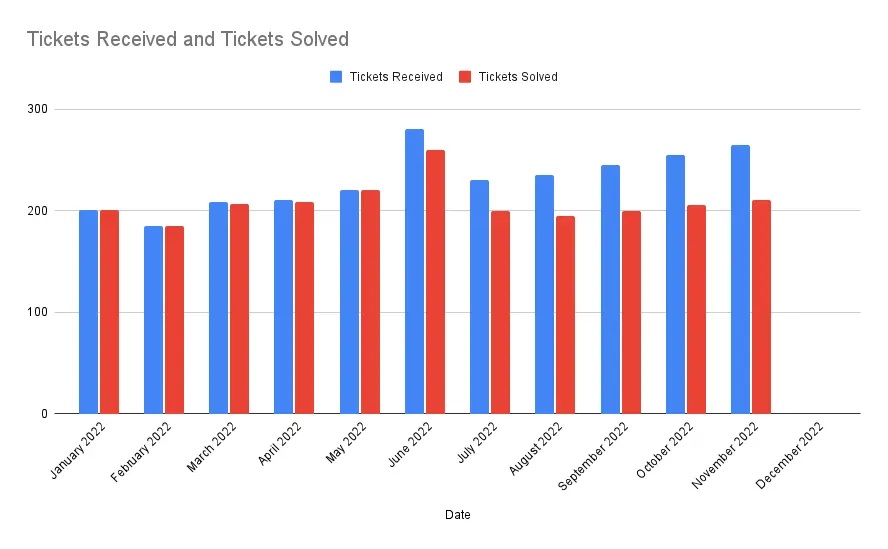
An out-of-the-box Google Sheets Chart:

It's basically the out-of-the-box default you get from Google Sheets. If you're not colorblind, bright red and blue colors draw your eyes in, but that's where it's usefulness stops. Can you tell what I'm trying to convey in the chart?
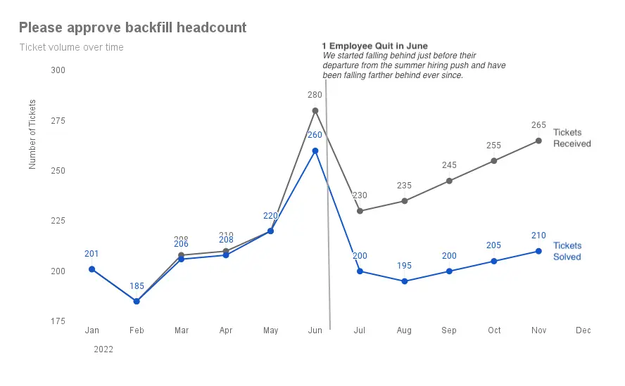
Improved version: Less clutter and a clear call to action

- Chart type changed to line which better represents data over time.
- Less important information colored grey and important information bolded or colored blue.
- Data legend moved inline with the data is easier to read.
- Call to action at the top of the chart.
- Bold text and a summary explaining the data in the chart.
- Horizontal month labels shortened and rotation removed.
- Data point labels enable readers to calculate the numerical difference between points.
- Red & Green are not legible for colorblind readers. Grey and blue were used instead.
Side by side

My Notes
Simplify communication down to the most critical pieces, constantly ask yourself if you can simplify this or remove that and still get your point across.
Start with understanding the context for the need to communicate. 1. Who are you communicating to? 2. What do you want your audience to know or do? 3. How can you use data to help make your point?
- Get specific about the audience. More specific than "stakeholders" or "anyone interested".
- What do you want your audience to know or do?
- Communicate with confidence
- What tone do you want?
Context questions: - What would a successful outcome look like? - If you were limited on time, what would your audience need to know?
3 Minute Story & Big Idea: - one paragraph and a single statement to explain "so-what" - ensure you are clear and can articulate your story - Big Idea has your point of view, convey what's at stake, and be a complete sentence.
Storyboard to ensure communication is structured properly.
Visuals to use: - Simple text is great for sharing a specific number or two. - Tables are read. Work well for communicating a number of things raelevant to different audience members. People will immediately start reading a table, so use accordingly - avoid them in presentations. Use minimal table designs - Heatmap can be used like a table but has visual cues. - Scatterplots for relationships between two things. - Line graphs for continuous data. - Slopegraph is useful for comparison between two points in time. - Bars should not be avoided. Use them because they are common and require less of a learning curve. - Always use a 0 baseline for bars. Doing otherwise provides a false visual comparison - Vertical and stacked vertical bar charts - Waterfall chart is like a stacked bar chart with pieces pulled apart to focus on one at a time or show increases and decreases from a starting point. - Horizontal bar chart should be the go-to for categorical data because they are easier to read than vertical.
Visuals to avoid: - Area graphs because we (humans) don't do a good job comparing two dimensional space. - "Pie charts are evil" - Never use 3D - Avoid a secondary Y-axis
Avoid clutter: - Reduce cognitive load by reducing clutter. - Gestalt principles of visual perception. - Proximity: We think close together objects are related. - Similarity: We think similar objects are related. - Closure: People like simple things that we arleady know. - Continuity: People seek the smoothest path. - Connection: Physically connected objects are seen as part of a group.
Don't fear white space. Get comfortable with it.
Our brains are hardwired to quickly pick up environmental differences. - Highlighting draws focus to specific elements. - Relative size denotes relative importance. - Use color sparingly. Typically design in shades of grey and then pick a single bold color to draw attention where it is needed. Blue avoids issues of colorblindness and prints well in black-and-white. Avoid shades of red and green. - Position on page. We zig-zag left to right, top to bottom.
Think like a designer - Limit highlighting to at most 10% of the visual design. - Ask yourself if eliminating this would change anything? - Deemphasize necessary but non-message-impacting items to the background. - Simplify, if it's hard to read, it's hard to do.
Tips for keeping communication and visuals simple: - Legibility: consistent font typeface and size. - Clean: keep it approachable with visual affordances. - Straightforward language: simple over complex, fewer words over more, define special language, spell out acronyms. - Remove complexity: favor simplicity.
Things every chart must have: - Chart title - Axis title (absence is confusing)
More aesthetic designs as perceived as easier to use than less aesthetic designs. They are also more readily accepted and result in more positive outcomes.
Storytelling: - Keep it simple, edit, and be authentic. Communicate for the audience, the story is for them. - Beginning: Tailor to audience's problem so they have a stake in solving it. - Middle: Address how to solve the problem. Contents: supporting examples, what will happen if no action is taken, options for addressing the problem, benefits of solution. - End: Call to action. - Narrative flow: Busy audience = lead with call to action. New audience = establish credibility. Most natural = chronologically. - Repetition: More repetition leads to a better chance of information retention. It will seem less repetitive to the audience than to you.
Tactics for clear presentations: - Horizontal logic: Read the title of each slide and check that they tell the story. - Vertical Logic: Read the content of the slide and the title. Each should support each other. - Reverse Storyboard: Read the contents and write down the main point from each page. The list should look like the storyboard/outline. - Fresh Perspective: Ask someone else to read the presentation and pay attention to what they thought was most important and where they had questions.
Final tips: - Practice, practice, practice - Learn tools well. If you're stuck, try a blank piece of paper first. - Iterate and seek feedback - Allow time. Expect it to take longer than you think. - Get inspired by good examples. - Have fun - Find your own style